University of Sheffield

Student Support App

The Student Help Kiosk featured categorised questions—addressing the 73% of students who previously struggled to find answers through a new search-first design.

Published: March 1, 2024

About University of Sheffield

The University of Sheffield's SSID team provides frontline student support, helping students access guidance and services throughout their academic journey. It acts as a central point of contact for wellbeing, administrative and academic-related support.

My Role

Contractor Product Designer

Timeline

2 months (Jan - Feb 2024)

Tools Used

Figma, Adobe XD, Miro, UserTesting

Project Type

Website

Student interview insights showing search-first behavior patterns

Summary (TL;DR)

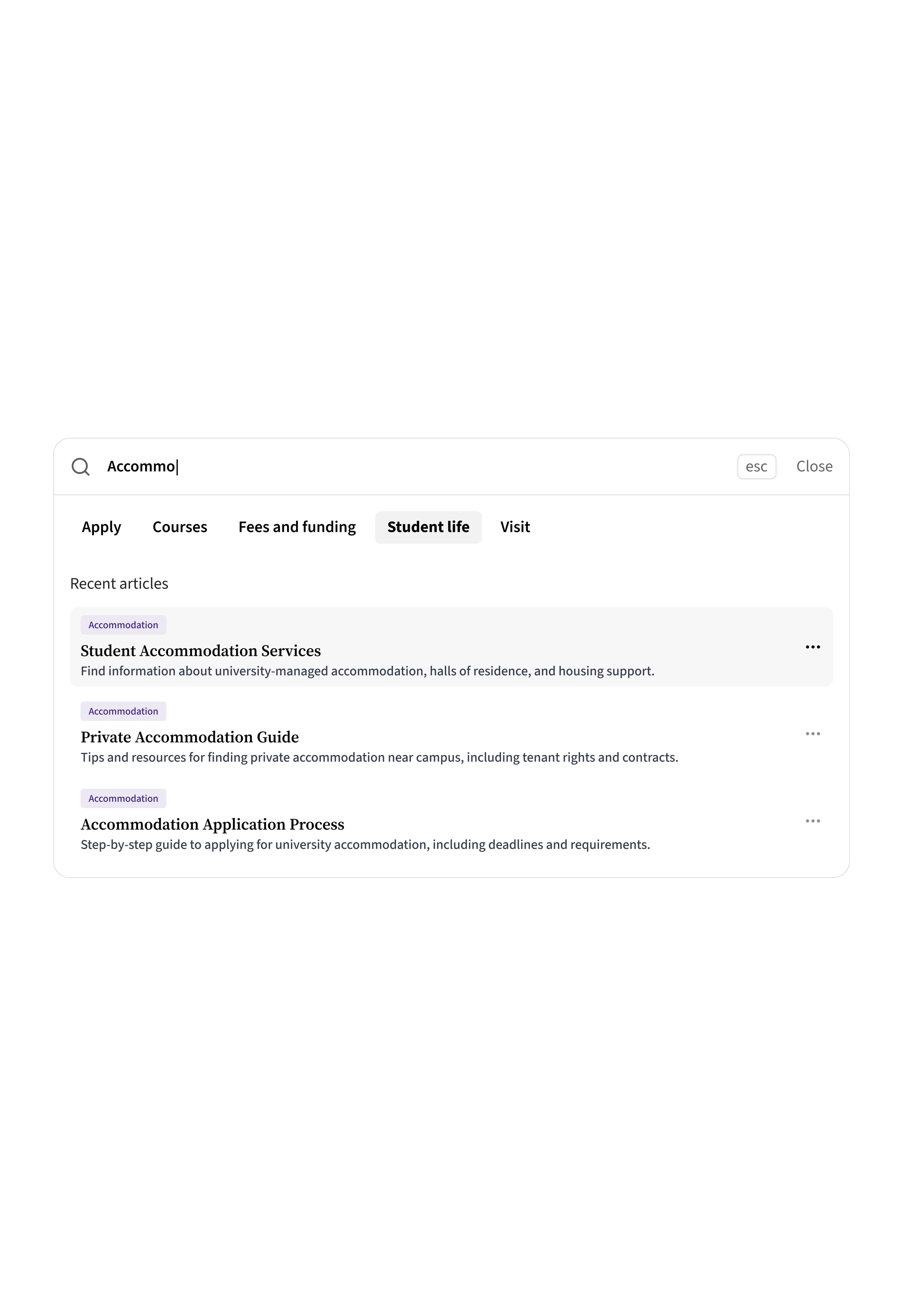
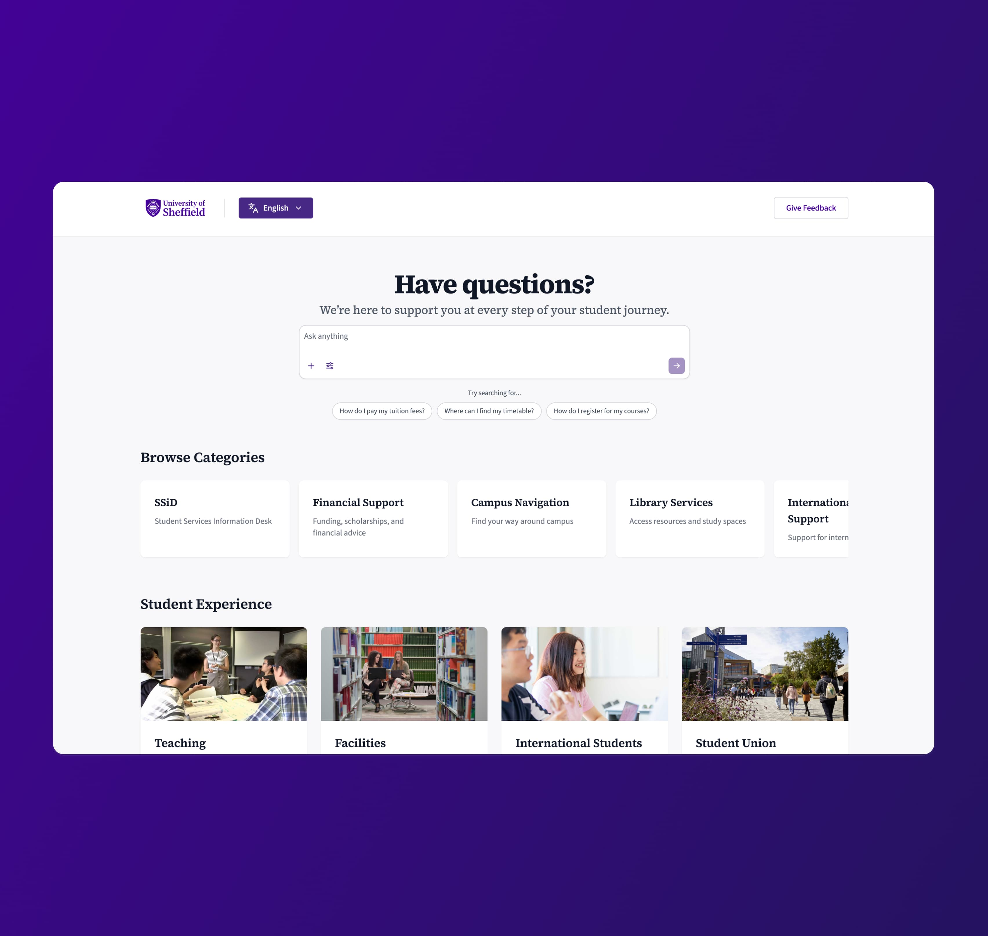
73% of students struggled to find answers. Search-first design changed that. I designed a self-service support solution that prioritized search functionality and subject-based discovery, putting answers at students' fingertips.

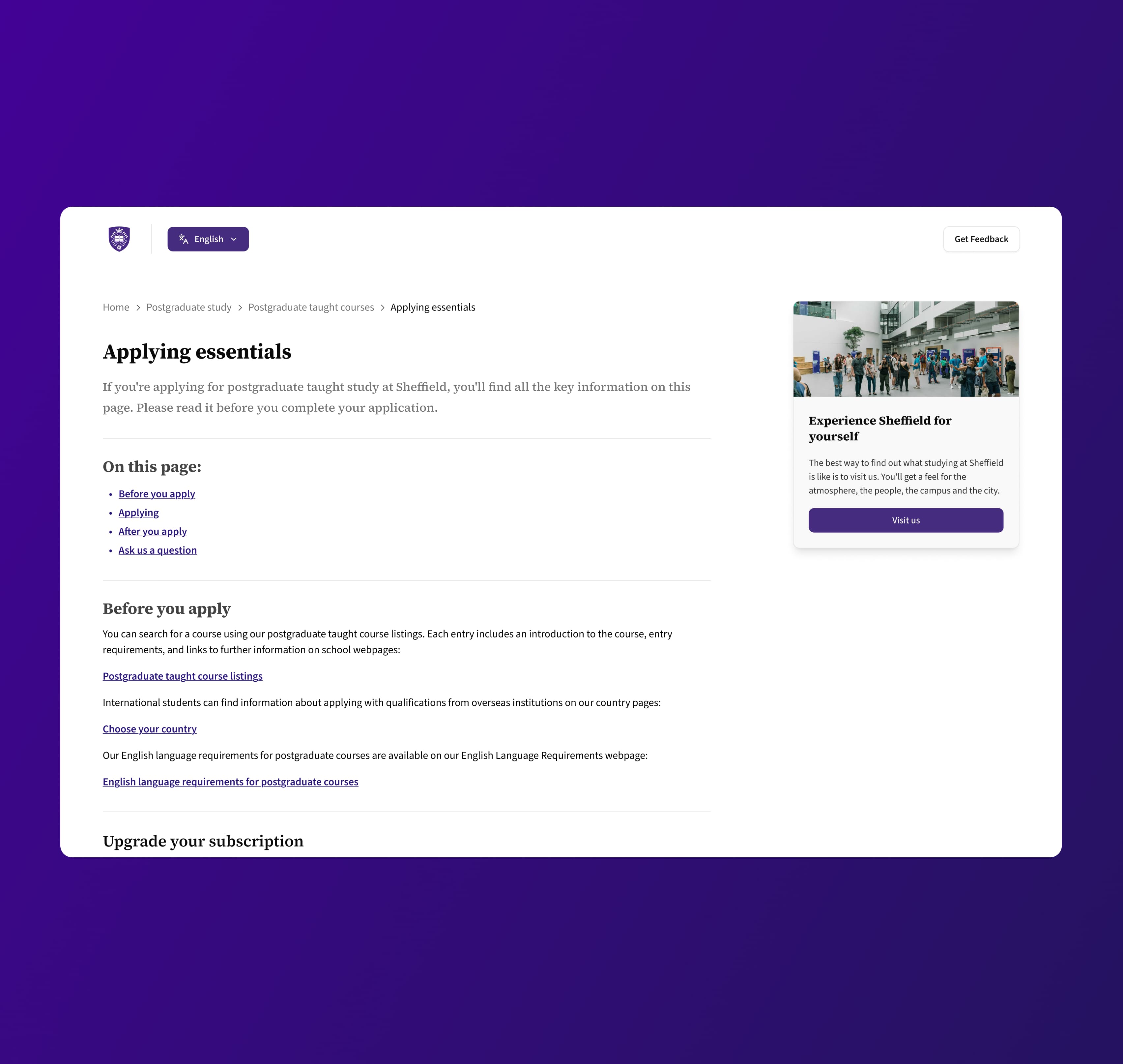
In 2024, I designed a self-service support solution for the University of Sheffield's Student Support Team (SSiD). Through survey research and focus groups, I discovered that students—especially international students—couldn't navigate the existing system effectively. By prioritizing search functionality and subject-based discovery, I created page layouts, interaction states, and a complete UI system that put answers at students' fingertips.

Note: Specific features and designs remain the University's intellectual property. This case study focuses on the design process using representative facades.


The Data: Navigation Chaos and Abandoned Searches

Working with the SSiD team, I analyzed user behavior data alongside session recordings and support ticket patterns. This analysis revealed a critical student experience challenge: students couldn't navigate the support system effectively, which directly drove higher support volumes and student frustration.

Connected Questions

How different query types connect to multiple related topics

3.4related answers per visit
Loading chart...
After analysing user questions and the existing website, we asked users to identify a range of scenarios in which students search for specific questions. We tracked how many recommended topics were relevant to each visit. On average, students required answers to three to four related questions per visit, highlighting the interconnected nature of their support needs. The chart illustrates where these connections exist.

Key findings included:

  • 73% of users couldn't find what they were looking for, showing the platform failed most students
  • Average time on site: 8+ minutes per session, yet students still left without answers
  • Students needed answers to 3-4 related questions per visit, not just one—but the system treated each as isolated
  • Search functionality had a 68% failure rate, with students reformulating queries multiple times before giving up
  • No clear success metric existed to determine whether a student actually found their answer

The real kicker? We couldn't definitively say when a student succeeded. Without a metric for discovery success, we were designing in the dark.

The Discovery Failure Funnel

Where students drop off in their search for answers

Students Visit Site
100%
Attempt Search
85%
Search Fails
68%
Browse Categories
45%
Still Can't Find Answer
73%
Find Answer & Leave
27%
Using the same group of students from the focus group, we also measured where they dropped off during their search for answers and the various outcomes.

Student interview insights showing search-first behavior patterns
From left to right: the revised article page compared to the old version. At a glance, users can scan the 'On this page' content list to quickly locate specific information. The content has been redesigned to be less generic and more student-focused, directly addressing the practical realities of the application process. Avoid overwhelming visitors with visual clutter or excessive imagery.

Before jumping to solutions, I needed to collaborate with the SSiD team to understand how students thought about their problems—whether they were searching by topic, navigating by page layout, or guided by content structure and logic.

Explorations • Explorations • Explorations • Explorations • Explorations • Explorations • Explorations • Explorations • Explorations • ExplorationsExplorations • Explorations • Explorations • Explorations • Explorations • Explorations • Explorations • Explorations • Explorations • Explorations
Exploration 1

Explore content that surfaces key topics from the home page in a more discoverable way.

Exploration 2

Revise the page layouts to help users quickly find the content they need.

Exploration 3

Improve the search so it is easy to discover, efficiently and returns accurate results.

Exploration 4

A significant gap exists between user intent and article discoverability.

Exploration 5

How might we redesign information architecture to improve discovery outcomes?

Insights from surveys, focus groups, collaborative efforts and exploratory research conducted during problem scoping revealed the following findings...

What I discovered:

  • Students think in subjects, not categories ("visa questions" not "immigration services")
  • Search was the preferred entry point—not browsing menus or reading pages
  • International students needed context and examples, not just policy text
  • Mobile usage was significant, especially for urgent queries
  • Students wanted to know if their question was already answered before contacting support

The message was clear: students needed a faster path to answers. But what would that look like in practice?


From Research to Design: Subject-Based Discovery

Armed with insights, I mapped the student support journey from question to answer. The existing flow had too many decision points, unclear categorization and dead ends.

I sketched multiple approaches to restructure information architecture around how students actually think:

  • Search-first design: Prominent search bar on every page
  • Subject-based navigation: Organized by student language, not administrative structure
  • Smart filtering: Quick filters for student type, urgency, and topic
  • Progressive disclosure: Show summaries first, details on demand

Working through wireframes and interaction states, I designed:

  • Page layouts that prioritized search and common questions
  • Interaction states for loading, errors, empty states, and success
  • UI components that formed a cohesive, accessible system
  • Mobile-responsive patterns for students on the go

Each design decision traced back to research findings. Search wins? Make it prominent. International students need context? Add examples and plain language. Students on mobile? Optimize for thumb-friendly interactions.


Implementation: Bringing the System to Life

I delivered comprehensive UI specifications including:

  • Complete page layouts for key support scenarios
  • Interaction and state documentation
  • Component library for consistent implementation
  • Accessibility guidelines for WCAG compliance
  • Mobile and desktop responsive breakpoints
Design process visualization
The search experience shows matching results instantly, giving users the ability to further refine their search using contextual filters.

The designs balanced student needs with the realities of university support: some questions need human intervention, policies must be communicated clearly and the system needed to scale across multiple departments.

Final UI deliverables showing search interface and results page
Key improvements include a simplified visual design, anchor links for quick navigation and student-focused content architecture.


Results and Outcomes

While final metrics are the University's property, the new system addressed the core problems identified in research:

Search-first design gave students immediate access to answers
Subject-based organization matched student mental models
Clear interaction states reduced confusion and abandonment
Accessible, mobile-friendly UI served all students effectively

The SSiD team now had a foundation to reduce support tickets, empower students with self-service and free up staff time for complex cases requiring personal attention.


What's Next

This project laid the groundwork for continuous improvement:

  • Analytics integration to track search success rates and identify gaps
  • Content optimization based on actual student queries
  • Multilingual support to better serve international students
  • AI-assisted search to handle natural language queries
  • Feedback loops to evolve based on student usage patterns

The real measure of success? When a stressed student at midnight can find the answer they need without waiting until morning.